Step-by-Step Tutorial: Watercolor Calligraphy Brushes for Procreate
I worked on my Watercolor Calligraphy Brushes for Procreate really hard to make them as realistic watercolor as possible and optimized for script calligraphy lettering. Throughout the development process, I came up with lots of techniques for getting the most realistic watercolor look possible. So that you can make the most out of this kit, I turned those tips into a tutorial for you!
Watch the video version below, or read the transcript below that!
I earn small commissions for purchases made through links in this post. Proceeds help me to continue producing free content.
Read the transcript version below!
Create a background
I have here a blank 8.5 x 11-inch canvas. To get started, I want to paint in a background that's more realistic than this stark white. I want something that really emulates watercolor paper. So in my brush palette, I’m scrolling down to the very, very bottom and starting with my own Cotton Paper Background Brush.

I created this brush to really emulate what traditional watercolor paper looks like, which, if you use it, you know that it’s never pure, pure white – it’s more like a soft off-white. So let’s start by selecting a nice off-white from our color palette. I’ve come over to the yellow-orange range and I’m pulling a bit away from the pure white. Not much, just slightly. Now I'll just paint over my canvas! I’ll zoom in here so that you can really get a good look and see that this really emulates the texture that real cotton watercolor paper has.

Choose TWO Colors
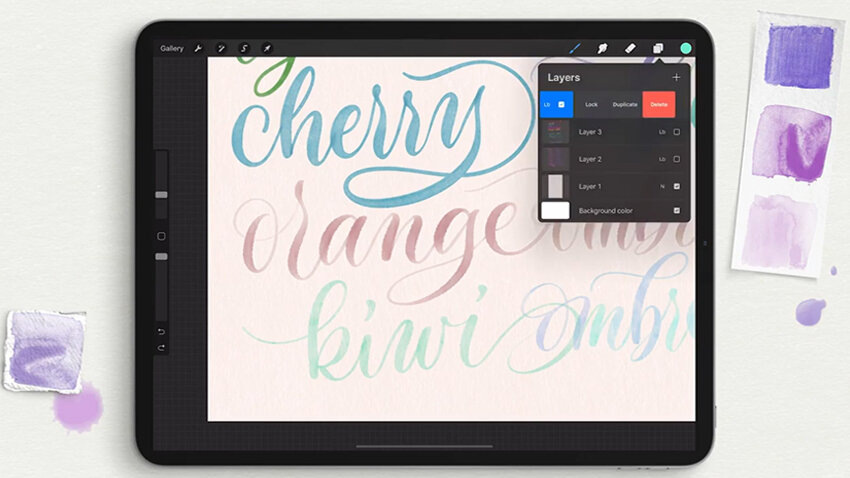
With my background created, I’ll make new blank layer. Now, here is something crucial that I want to point out to you, in case you've never utilized this tool in Procreate. See how up here in my color palette I have not one but two swatches? This is a relatively new, but very cool, aspect of Procreate where you can choose a secondary color to work with. So if I tap over on the second swatch, I can choose a second color for myself – something much higher contrast.
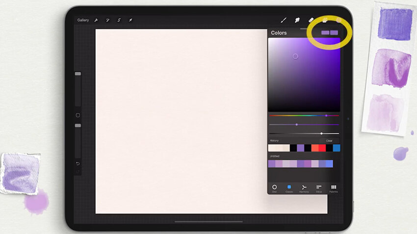
I’ll choose this fuchsia for my secondary color, and purple for my initial color. Now this comes into play when you’re creating ombré effect lettering and you’re using brushes that pull on a second color to incorporate into the first. This watercolor brush pack that I've created does pull on these a lot, and I'm going to demonstrate that for you here.
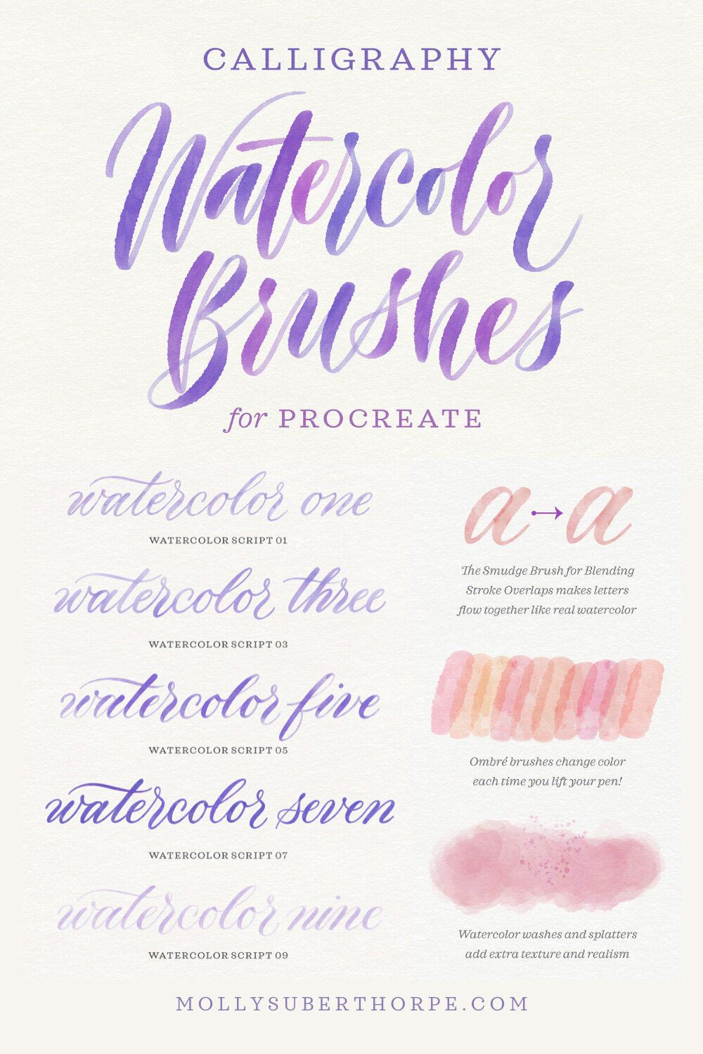
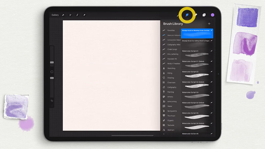
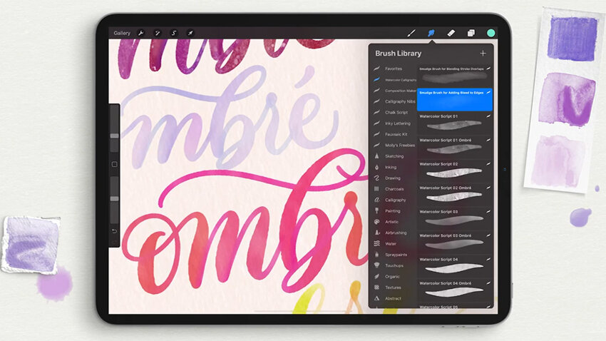
Looking through our Watercolor Script brush library, the very first two brushes are not for painting. They’re for smudging! This is a crucial element of the process of making realistic watercolor. These two brushes are used not with the paint brush tool, but with the smudge tool. So here in the Smudge tool, that's where you're going to want to come in and select these two brushes, depending on the use. (And don’t worry – I'm going to show you that!)
Draw with the Watercolor Script Brushes
Here in the brushes palette, let’s start with the brush Watercolor Script 01. You can see immediately that I have another brush right underneath it called Watercolor Script 01 Ombré. And that's the case with all of these specific brushes. All of them – 01 through 10 – have an ombré version right below it. Like I just said, ombré is the effect that pulls on these two colors in your palette.
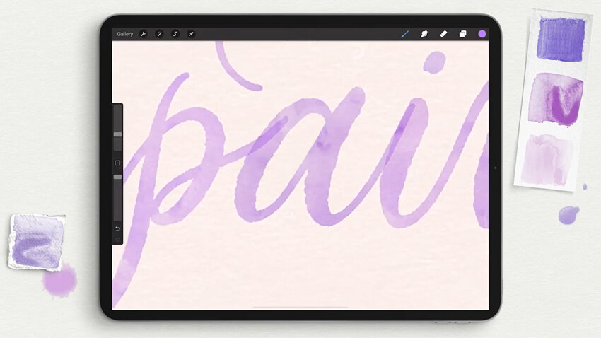
So let’s get started creating something! Here’s the word “paint” to start us off. Zooming in slightly, you can see this Watercolor Script 01 brush creates a beautiful paint stroke, that is kind of like a wobbly, uneven texture in each stroke.

Blend the Stroke Overlaps
The other thing you might first notice is that we have these regions where the strokes overlap. With any semi-translucent brush, you're going to get this kind of overlap. But if you’ve done your watercolor calligraphy, you know that that is not realistic because the wet paint would bleed into itself and there wouldn’t be such strong stroke overlaps. So this is where the Smudge brushes come in.
Go to the smudge brush palette and select the top one: Smudge Brush for Blending Stroke Overlaps. It’s exactly what it sounds like. I’ll zoom in here and very lightly smudge this out. I like to sometimes leave little dark spots because that is realistic in watercolor, to have more concentrated spots of color and less concentrated spots.
Understanding the Ombré Color Changing Effect
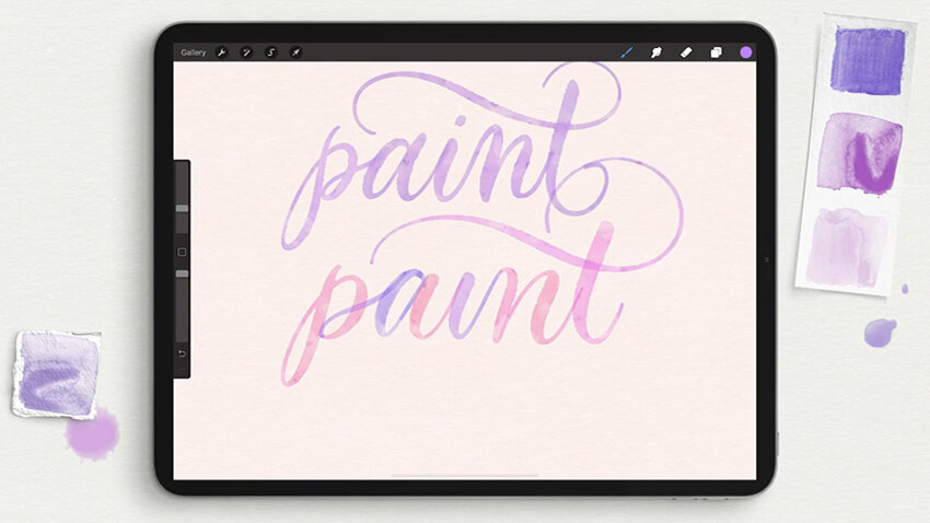
So there you have our word painted with Watercolor Script 01. What happens if we select the same brush in the ombré version this time? There are a couple of things to note when you're painting with ombré. The color changes every time you lift your pen and put it down again. So if I were to create a word and never lift my brush, the color is not going to change. So it is crucial with all types of ombré brushes that you lift your pen wherever you want the color to change.

Let's just try writing out that same word, knowing full well that we can use that smudge brush next to really blend these colors together. Because this is that Watercolor Script 01 brush, just like the above, the texture of the strokes and the opacity and all of that are the same. The only difference is the actual color change in the ombré effect. Now I’ll come in with my smudge brush – the same one as before – and smudge these out.
There you have it: an ombré version and non-ombré version of the exact same brush. You can really see that the ombré version of this brush picks up a lot of colors in the purple range. It went a bit into the pinks, into the corals, and into the blues. I designed the ombré brushes like this on purpose, because that means that you don't have to go and change your swatches between letters!
Change the Blending Mode
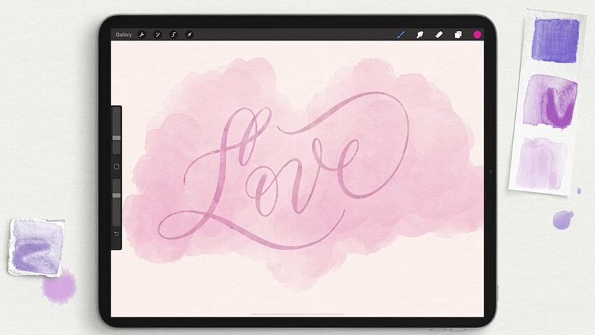
Before I move on to demonstrate all of the other brushes, I want to show you a great trick for making these words immediately look even more realistic. Go into your layers palette and tap the “N” icon on the far right of the layer, and then adjust the blending mode. All I want to do is change the blending mode from normal to Linear Burn.
Now, do you see the difference? It's subtle, but what that did was allow the texture of that cotton paper below it to really shine through as if the color has bled into that paper, and been absorbed slightly more unevenly than our original painting. And that is very realistic for watercolor: the texture of the paper that you use really does dictate how your paint dries, how it’s absorbed, and how the paint color concentration appears once it’s dry.

Demonstration: Watercolor Script Brushes 01 – 10
Now, I’ll create a blank layer and set it immediately to Linear Burn, because I know I like all of my watercolor layers set to that blending mode. I'll now do a quiet demonstration of all ten script brushes in this pack, plus their ten ombré versions.
Below, you can really see the range of strokes and textures and opacities that are present in all ten of these brushes, and how the ombré brushes have different color changing effects and characteristics!

The Quick Reference Guide
In the instructional file that I’ve given you, which comes as a layered Procreate file and a PDF, I’ve also provided a sample page of all the brushes so that you'll have a quick reference to compare all ten brushes: their translucency, textures, bleed, etc. I also provide you samples of the different ombré color changes of each of the ten brushes, and some samples showing the ways in which the primary and secondary colors that you choose from your swatches will affect the color change.

Create Additional Edge Bleed
Now there are a couple more techniques for adding more watercolor texture to the letterforms themselves. One of them is to use the second type of smudge brush: Smudge Brush for Adding Bleed to Edges. (Remember to use it with your Smudge tool!) If you use this, play around a lot with the opacity, because it’s really going to give you a different effect based on how light or dark the color of your letters are.
Let's zoom into this e. This was drawn with a brush that has a relatively crisp stroke, but let’s say that you want it to bleed more. Well, then you can take that smudge brush and you can just pull it around the edges. You're going to just soften and remove that crisp edge and create a more natural looking bleed into the paper.

Darken Your Paint Colors
The other little hack for adding realism is that you can play around a lot with the lightness and darkness of the watercolors. Remember I said that a lot of them have translucency? Well, let’s say that you want to use one of the brushes, but have it be a bit less translucent.
All you’re going to do is select your art layer, swipe left, and duplicate it. And because there's some translucency, when the two layers overlap, they become a lot darker. Then, each of the blending modes that you choose will create different effects based on how they lay over the layer below it, so have fun playing with different types of blending!
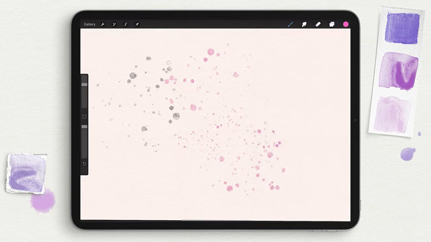
Watercolor Splatter Stamp Brush
Now I want to walk you through the other types of brushes that come in this brush pack, apart from the actual script lettering brushes themselves.
Scrolling down here, you’ll see, first of all, the Watercolor Splatter Stamp. It does adhere to the size of your brush, so you can make tiny splatters and much bigger ones, too. I think that the combination of different sizes adds some realism. Just like the lettering layers, in order to darken these splatters, you just duplicate them. You can do so as much as you want and you can get more or less translucency depending on your design.
Watercolor Wash Brushes
Next, we’re looking at the Watercolor Washes. I have four different Watercolor Washes, plus ombré versions of each one. In that same quick reference guide packet that I give you as a PDF and a Procreate file, I also include samples of the watercolor washes – the individual ones, the backgrounds, and the splatters – so that you also have samples of these to look at as references.

Below is Watercolor Wash 01. You'll see that it also adheres to the size of your brush and is pressure sensitive – all of these watercolor washes are, in fact. So if I very lightly wash over my screen, I get a light wash and if I press hard, I get a much darker one.

So below is what Watercolor Wash 02 looks like. If I zoom in and compare the edges, you can see that 02 has more brush strokes coming off of it. It isn't as crisp and watery on the edges as 01. And now for the ombré version. Zooming in here, you can see that I have that golden color and the pink blending together almost as if you went over your page once with pink and then dotted the orange on again afterward.

Now I’ll paint Watercolor Wash 03. This one has more translucency, but it's still pressure sensitive. So this is pressing down hard, and this is pressing down lightly. But when I zoom in, you can see that there's more texture in this wash compared to, say, the first and the second. Here’s the ombré version. I'm lifting as I go here, and you can see that I just get even more of a range between that orange and the pink in this particular wash brush.
And below is Watercolor Wash 04. This is the most textured of all. Again, it’s pressure sensitive, but you’re getting that dark to light, plus darker texture and lighter texture. And now the ombré version. This really focuses more on merging to the center point between the two swatches, so you get this nice coral color.

These washes are useful for making backgrounds, like the example below. Reduce the opacity slightly, and then on a new layer, create some watercolor calligraphy right over top of it.
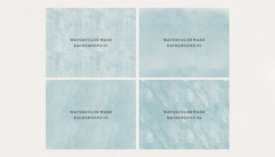
Watercolor Wash Background Brushes
Now I have another set of watercolor wash brushes, but these are for backgrounds, so they don't have those edges there for covering your entire canvas. You
These are meant to be used with, of course, any color. But if you use a darker color, you can always come back in and reduce the opacity. And again, setting their layer to Linear Burn helps that paper texture really come through your background. Watercolor Wash Background 01 has a speckled texture and pigmentation, while Watercolor Wash Background 02 has more of a cloudy effect. Watercolor Wash Background 03 is, again, cloudy, but even more texture to stroke.
And finally, Watercolor Wash Background 04. If you've ever done watercolor washes with real watercolor and then used the technique where you sprinkle salt on top of the drying paint, this is the effect that you get. It's like these grains of salt absorb the liquid and they create darker spots with light areas around them. It's one of my favorite, most relaxing things to do, actually. So I really wanted to make a brush that emulated that to some degree.
Soft Graphite Pencil Brush
And last but not least, the second bonus brush in this pack is the Soft Graphite Pencil because what watercolor tool kit would be complete without something to sketch with? This is both pressure sensitive and tilt sensitive. So if I brush lightly, I get a light pencil. If I press hard, I get a dark pencil. If I use my pen more upright, I get s sharp line. But if I tilt my pen at an angle, just like with a real pencil, and I brush sort of with the side of the tip of my stylus, I get this sort of softer shading look.

Watercolor Calligraphy Brush Pack for Procreate
37 PROCREATE BRUSHES:
20 Watercolor Script brushes for both single-color and ombré calligraphy
8 Watercolor Wash brushes for adding texture and depth
4 Watercolor Wash Background brushes for painting your canvas
1 Splatter Stamp for realistic paint details
2 Smudge brushes for blending stroke overlaps and adding extra bleed
Bonus! 1 Cotton Paper brush for making extremely realistic paper backgrounds
Bonus! 1 Soft Graphic Pencil brush for sketching and adding colored pencil detail
Or learn even more about what’s included in the Watercolor Calligraphy Brush Pack in the product launch post.
Tools used in the video:
Watercolor Calligraphy Procreate Brush Pack
Procreate App
12.9" iPad Pro
Apple Pencil
Touch screen glove